The Handshake You Leave Behind: Why Business Cards Still Matter in 2026
In an era dominated by AI-driven networking and instant LinkedIn connections, you might wonder: “Is the printed business card finally obsolete?” The short answer is a resounding no. In fact, as our digital lives become more cluttered, the physical act of handing over a beautifully crafted visiting card has become a powerful differentiator. It’s no longer just a carrier of contact info; it’s a tactile brand experience.
Here is why business card printing is seeing a massive revival and how you can make yours stand out this year.

1. The Psychology of Touch (Tactile Branding)
We process physical objects differently than digital ones. When you hand someone a card with a soft-touch lamination or a raised Spot UV finish, you aren’t just giving them your phone number—you’re engaging their sense of touch.
- Textured Cardstock: Using linen or hammered paper suggests craftsmanship.
- Weight Matters: A thick, premium card (350 GSM+) feels substantial and “trustworthy” compared to a flimsy, thin one.
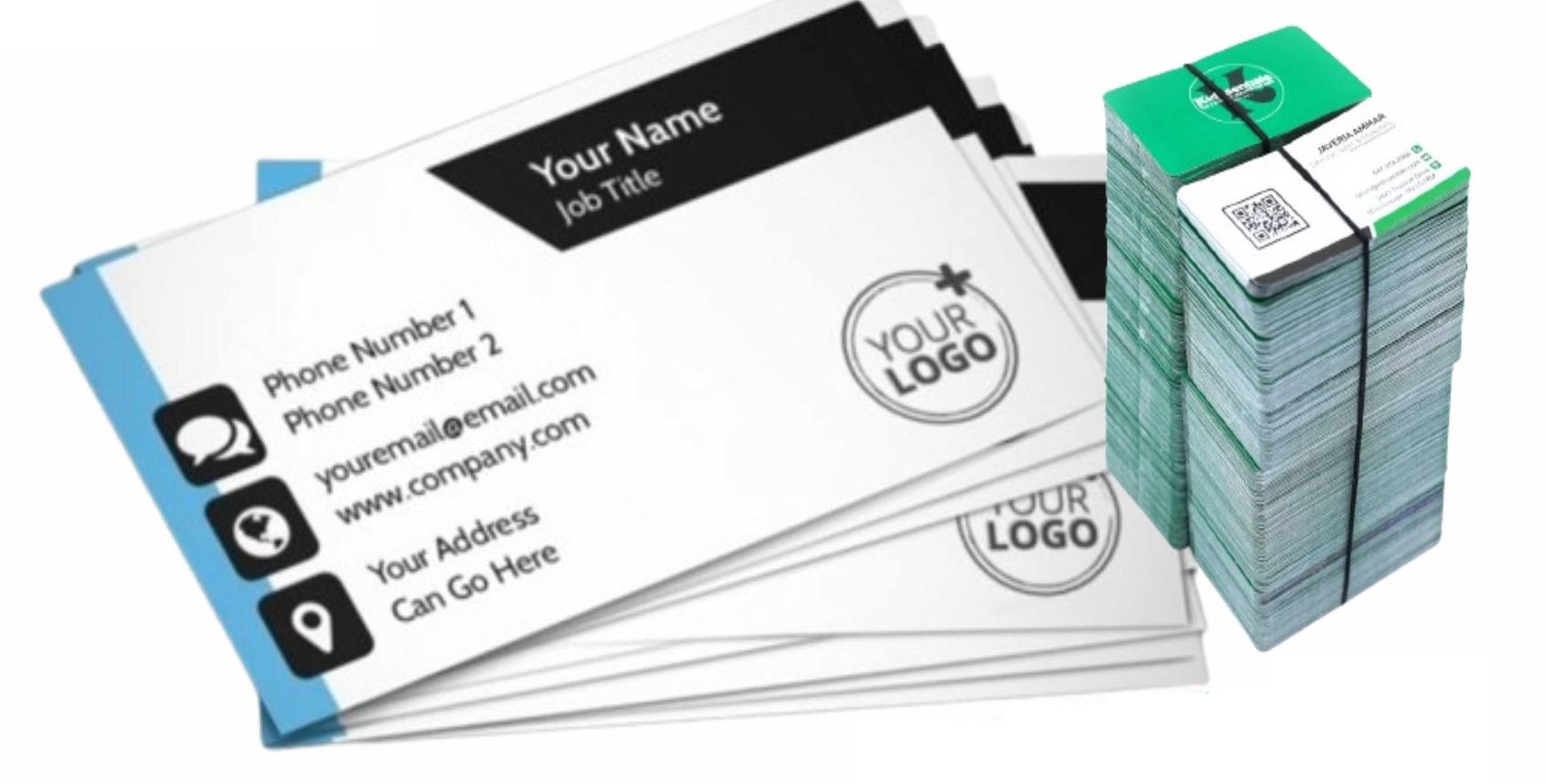
2. Bridging the Gap: The Smart Business Card
2026 is the year of the hybrid card. We are seeing a huge trend in integrating digital shortcuts directly into the print design.
- Dynamic QR Codes: Instead of a cluttered card with ten social media icons, modern designs feature a single, sleek QR code that links to a digital portfolio or a “Linktree” style page.
- NFC Integration: Some high-end cards now include embedded chips that allow a contact to simply “tap” the card to your phone to save details instantly.
3. Design Trends to Watch
If you’re planning a reprint at your local Lahore shop, consider these 2026 design shifts:
- Minimalism 2.0: Moving away from “busy” designs. Bold typography and lots of “white space” are currently the gold standard for high-end corporate branding.
- Unique Shapes: Die-cut cards (circular, leaf-shaped, or slim-cut) break the visual monotony of the standard rectangle.
- Eco-Friendly Choices: Recycled “Seed Paper” or Kraft cards are becoming the top choice for sustainable brands.
Pro-Tips for Your Next Print Run
- Don’t ignore the back: The back of your card is prime real estate. Use it for a bold logo, a powerful slogan, or even a small appointment grid.
- Legibility is King: No matter how “cool” a font looks, if your email address is unreadable, the card has failed. Keep essential text at at least 8pt size.
- Color Consistency: Ensure your printer uses high-quality CMYK digital printing so the colors on your card match your letterheads and signage perfectly.
The Verdict
Your visiting card is often the only physical reminder a lead has of you after a meeting ends. In a sea of “followed” profiles and deleted emails, a high-quality printed card sits on a desk, pinned to a board, or tucked in a wallet—waiting for the moment it’s needed.